
Hello,
I hope you are all enjoying the warm weekend. This week I want to talk about a very important modern web feature: custom context menus. When you right-click on your screen, you will probably see something that looks similar to this:

That’s all fine and dandy, but what if we want to personalize this menu it to improve our own app? Say hello to the customized context menu:

You might have seen something like this on sites like Google Drive, Dropbox, and countless others. It allows the user to have more control over the app in a way that they’re already familiar with.
If you have an Angular app, this functionality can be implemented with the ngx-contextmenu library:
https://www.npmjs.com/package/ngx-contextmenu
This package allows you to fully customize your own context menu complete with data input, style configuration, and the ability to create nested menus. This library is also compatible with Bootstrap.
Today we’ll make a simple file management system and use custom context menus to create, rename, and delete files and folders.
Skill Prerequisites
- Fundamental HTML and CSS/SCSS knowledge
- Experience with Angular 2+ and TypeScript.
- Familiarity with Angular Material components.
Source Code
Feel free to use the completed project as a reference:
https://github.com/LucyVeron/manilla
Procedure
Alright, we’re using the same procedure from previous tutorials. First let’s make sure we have the latest Node and npm installed on our system. Download them here:
- Node: https://nodejs.org/
- npm: https://www.npmjs.com/
Next we’ll set up our Angular project. Install the Angular CLI tool:
npm install -g @angular/cli
Generate a new project:
ng new document-manager
Change to the directory of the newly-created project:
cd document-manager
Add Angular Material:
ng add @angular/material
Run the local dev server:
ng serve
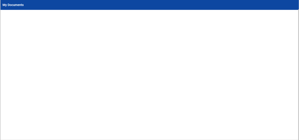
Check localhost:4200 in your browser:
We’ll replace the current HTML with a simple Material toolbar:
app.component.html
<mat-toolbar color="primary">My Documents</mat-toolbar>
Import the Toolbar module as we do with all our Material components:
app.module.ts
import { MatToolbarModule } from '@angular/material/toolbar';
...
@NgModule({
...
  imports: [
    ...
    MatToolbarModule
  ],
Check localhost:4200 again to see our app:
Now, we want to create new files and folders, so we’ll make a context menu to do just that. Go ahead and install the npm package and the Angular CDK package as it is required to use this feature:
npm install ngx-contextmenu @angular/cdk
Add the corresponding module to your imports with forRoot() in order to use all of the library’s directives:
app.module.ts
import { ContextMenuModule } from 'ngx-contextmenu';
...
@NgModule({
...
  imports: [
    ...
    ContextMenuModule.forRoot()
  ],
CAVEAT: If you are using Angular 5 or over, make sure to use the ngx-contextmenu@4.2.0 version of this package.
Now that we’ve got our library set up, let’s make the context menu. We want a menu with two options: create files and create folders:
app.component.html
<div class="container" [contextMenu]="basicMenu">
    <mat-toolbar color="primary">My Documents</mat-toolbar>
    <div class="folder-wrapper">
        <div class="folder" *ngFor="let item of items;">
            <mat-icon color="accent">{{item.icon}}</mat-icon>
            <small>{{item.name}}</small>
        </div>
    </div>
</div>

<context-menu #basicMenu>
    <ng-template contextMenuItem (execute)="addItem('folder')">
        <mat-icon>add</mat-icon>
        <span>New folder</span>
    </ng-template>
    <ng-template contextMenuItem (execute)="addItem('file')">
        <mat-icon>add</mat-icon>
        <span>New file</span>
    </ng-template>
</context-menu>
Alright, we’ve got a lot going on in our template. We made a container class to represent the clickable area on the screen. We are using the [contextMenu] property to bind the context menu, called basicMenu, to the container. This triggers the menu when we right-click on the screen. The <context-menu> tag contains an <ng-template> with the contextMenuItem directive for each menu option that we desire. We can bind a click event with (execute) to each option, which lets us create either folders or files. Last but not least, we’ve set up an *ngFor loop to display our items, which are stored in the aptly-named “items” array.
Here’s our component file:
app.component.ts
import { Component, ViewChild } from '@angular/core';
import { ContextMenuComponent } from 'ngx-contextmenu';

export interface Item {
  icon: string;
  name: string;
}

@Component({
  selector: 'app-root',
  templateUrl: './app.component.html',
  styleUrls: ['./app.component.scss']
})
export class AppComponent {

  @ViewChild(ContextMenuComponent) public basicMenu: ContextMenuComponent;

  public items: Item[] = [];

  public addItem(type: string): void {
    switch (type) {
      case 'file':
        this.items.push({
          icon: 'insert_drive_file',
          name: 'new_file'
        });
        break;
      case 'folder':
        this.items.push({
          icon: 'folder',
          name: 'new_folder'
        });
        break;
      default:
        break;
    }
  }
}
In the component file, we’ve added the basicMenu variable with the @ViewChild decorator to have a reference to the template element. We also see the empty items array and the addItem() method, which populates the array with new items and their details wrapped in an object.
We’ll add some styling to our menu and the application. The contextMenuItem directive generates default HTML that looks like this by default:
<div class="dropdown ngx-contextmenu">
  <ul class="dropdown-menu">
    <li>
      <a><!-- content --></a>
      <span><!-- passive content --></span>
    </li>
  </ul>
</div>
We’ll add our own styles simply by manipulating the “ngx-contextmenu” class:
app.component.scss
.container {
  height: 100vw;
}
.folder-wrapper {
  display: flex;
  flex-wrap: wrap;
  margin: 2rem;
  .folder {
    position: relative;
    display: flex;
    align-items: center;
    justify-content: center;
    margin: 1rem;
    width: 100px;
    height: 100px;
    & mat-icon {
      position: absolute;
      top: -3px;
      left: 0px;
      font-size: 100px;
    }
    & small {
      position: absolute;
      bottom: -15px;
      text-align: center;
    }
  }
}

::ng-deep {
  .ngx-contextmenu {
    & .dropdown-menu {
      border-radius: 3px;
      padding: 0;
      box-shadow: 0px 3px 5px -1px rgba(0, 0, 0, 0.2),
        0px 5px 8px 0px rgba(0, 0, 0, 0.14),
        0px 1px 14px 0px rgba(0, 0, 0, 0.12);
    }
    & mat-icon {
      font-size: 22px;
    }
    & li {
      display: block;
      border-bottom: 1px solid lightgrey;
      &:last-child {
        border-bottom: none;
      }
    }
    & a {
      display: flex;
      align-items: center;
      padding: 0.5em 1em;
      text-decoration: none;
      color: darkslategrey;
      background: white;
      &:hover {
        background-color: ghostwhite;
      }
    }
  }
}
Add the new Angular Material modules to our imports:
app.module.ts
import { MatIconModule } from '@angular/material/icon';
import { MatButtonModule } from '@angular/material/button';
...
@NgModule({
...
  imports: [
    ...
    MatIconModule,
    MatButtonModule,
  ],
…now the result should look like this:
Alright, looks pretty good so far. Now we’ll take it a step further and create a new context menu specifically for the items. Our goal is to allow the user to rename and delete items. Let’s update the HTML:
app.component.html
<div class="container"
     [contextMenu]="basicMenu">
    <mat-toolbar color="primary">
         My Documents
    </mat-toolbar>
    <div class="folder-wrapper">
        <div class="folder"
            *ngFor="let item of items; let i = index;"
             [contextMenu]="itemMenu"
             [contextMenuSubject]="{item: item, index: i}">
            <mat-icon color="accent">
                  {{item.icon}}
            </mat-icon>
            <small>{{item.name}}</small>
        </div>
    </div>
</div>

<context-menu #basicMenu>
    <ng-template contextMenuItem
             (execute)="addItem('folder')">
        <mat-icon>add</mat-icon>
        <span>New folder</span>
    </ng-template>
    <ng-template contextMenuItem
             (execute)="addItem('file')">
        <mat-icon>add</mat-icon>
        <span>New file</span>
    </ng-template>
</context-menu>

<context-menu #itemMenu>
    <ng-template contextMenuItem
             (execute)="editNameDialog($event.item)">
        <mat-icon>edit</mat-icon>
        <span>Rename</span>
    </ng-template>
    <ng-template contextMenuItem
             (execute)="deleteItem($event)">
        <mat-icon>delete</mat-icon>
        <span>Delete</span>
    </ng-template>
</context-menu>
We’ve again added the [contextMenu] property to attach each item to the new context menu, as well as the [contextMenuSubject] property to pass data about the item and its array index to the menu. In #itemMenu, we’ve created two new options: Rename and Delete. We can pass data into their corresponding methods using the $event variable captured from our click.
Speaking of which, let’s update our component file to add those functions. editNameDialog() opens a dialog to let us change the filename, and deleteItem() simply removes the item from our array.
app.component.ts
import { Component, ViewChild } from '@angular/core';
import { MatDialog, MatDialogRef } from '@angular/material/dialog';
import { ContextMenuComponent } from 'ngx-contextmenu';
import { ChangeNameDialogComponent } from './change-name-dialog/change-name-dialog.component';

export interface Item {
  icon: string;
  name: string;
}

@Component({
  selector: 'app-root',
  templateUrl: './app.component.html',
  styleUrls: ['./app.component.scss']
})
export class AppComponent {

  @ViewChild(ContextMenuComponent) public basicMenu: ContextMenuComponent;

  public items: Item[] = [];
  public changeNameDialogRef: MatDialogRef<ChangeNameDialogComponent>;

  constructor(public dialog: MatDialog) { }

  public addItem(type: string) {
    switch (type) {
      case 'file':
        this.items.push({
          icon: 'insert_drive_file',
          name: 'new_file'
        });
        break;
      case 'folder':
        this.items.push({
          icon: 'folder',
          name: 'new_folder'
        });
        break;
      default:
        break;
    }
  }

  public editNameDialog(target: Item) {
    const dialogRef = this.changeNameDialogRef =
      this.dialog.open(ChangeNameDialogComponent, {
         data: target
      });
  }

  public deleteItem(event: any) {
    this.items.splice(event.item.index, 1);
  }
}
Now let’s generate the dialog component with the Angular CLI tool:
ng g c change-name-dialog
Ok, here is the code for the dialog component that we will open to edit the filename:
change-name-dialog.component.ts
import { Component, Inject } from '@angular/core';
import { MatDialogRef, MAT_DIALOG_DATA } from '@angular/material/dialog';

@Component({
  selector: 'app-change-name-dialog',
  templateUrl: './change-name-dialog.component.html',
  styleUrls: ['./change-name-dialog.component.scss']
})
export class ChangeNameDialogComponent {

  constructor(
    @Inject(MAT_DIALOG_DATA) public data: any,
    public dialogRef: MatDialogRef<ChangeNameDialogComponent>
  ) { }
}
change-name-dialog.component.html
<button mat-icon-button
        (click)="dialogRef.close()"
        style="float:right;">
    <mat-icon>clear</mat-icon>
</button>
<h1 mat-dialog-title>Change Name</h1>
<div mat-dialog-content>
    <mat-label>Name</mat-label>
    <input matInput [(ngModel)]="data.item.name">
</div>
Nothing special here, we’re just letting the user change the name in the input using two-way [(ngModel)] binding to automatically update it.
And that’s it!! We’re done. Now you understand some of the basic capabilities of the ngx-contextmenu library and successfully integrated it into a single-page application. As a bonus challenge you can try to add a new menu option to change the file color. Good luck!


 The Computer Chick
1 Comment