
Hello,
If you’re an Internet user, chances are you may have already used a progress wizard, otherwise known as a stepper. It may look something like this:

This website component can be used for payment processing, installations, signups, surveys, and a lot more. So why not learn how to make our very own wizard with Angular Material’s Stepper as seen above? Check out the official documentation here:
https://material.angular.io/components/stepper/overview
Let’s say we have an online clothing store that allows our customers to build a personalized capsule wardrobe from scratch.

To do that, we’ll create a stepper with 4 steps:
- Step 1: Skin undertone
- Step 2: Personal style
- Step 3: Current season
- Step 4: Done
The user will make their choice in each step and be able to move with NEXT and BACK buttons. The final step will allow them to reset the stepper and clear their selections.
Skill Prerequisites
- Fundamental HTML and CSS/SCSS knowledge
- Experience with Angular 2+ and TypeScript
- Familiarity with Angular Material components
Source Code
If you want to skip the tutorial, you can clone the final result here:
https://github.com/LucyVeron/capsule-wardrobe
Procedure
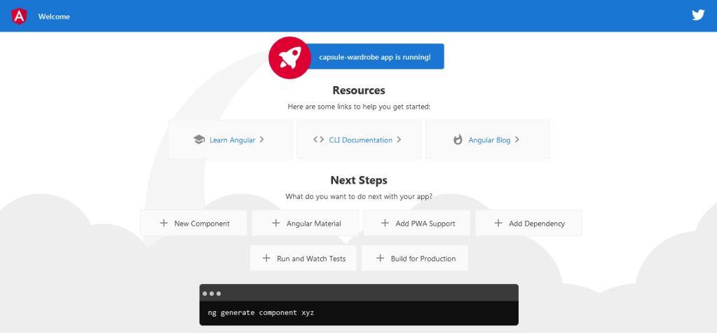
First let’s make sure we have the latest Node and npm installed on our system. Download them here:
- Node: https://nodejs.org/
- npm: https://www.npmjs.com/
Next we’ll set up our Angular project. Install the Angular CLI tool:
npm install -g @angular/cli
Generate a new project:
ng new capsule-wardrobe
Change to the directory of the newly-created project:
cd capsule-wardrobe
Add Angular Material:
ng add @angular/material
Run the local dev server:
ng serve
Check localhost:4200 in your browser:
Next we’ll add the Stepper module from Angular Material. We’ll also throw in some other component modules which will be included in our stepper:
app.module.ts
import { NgModule } from '@angular/core';
import { MatButtonModule } from '@angular/material/button';
import { MatButtonToggleModule } from '@angular/material/button-toggle';
import { MatRippleModule } from '@angular/material/core';
import { MatIconModule } from '@angular/material/icon';
import { MatStepperModule } from '@angular/material/stepper';
import { BrowserModule } from '@angular/platform-browser';
import { BrowserAnimationsModule } from '@angular/platform-browser/animations';
import { AppComponent } from './app.component';

@NgModule({
  declarations: [
    AppComponent
  ],
  imports: [
    BrowserModule,
    MatStepperModule,
    MatButtonModule,
    MatButtonToggleModule,
    MatRippleModule,
    MatIconModule,
    BrowserAnimationsModule
  ],
  providers: [],
  bootstrap: [AppComponent]
})
export class AppModule { }
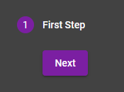
Now we’ll add the stepper template to our HTML with a blank first step:
app.component.html
<mat-vertical-stepper #stepper>
  <mat-step>
    <ng-template matStepLabel>First Step</ng-template>
    <div>
      <button mat-raised-button color="primary" matStepperNext>Next</button>
    </div>
  </mat-step>
</mat-vertical-stepper>
…and here is what it will look like:
Now let’s fill out the first step by allowing the user to select their skin undertone:
app.component.ts
import { Component } from '@angular/core';

@Component({
  selector: 'app-root',
  templateUrl: './app.component.html',
  styleUrls: ['./app.component.scss']
})
export class AppComponent {
  public colors = ['cool', 'neutral', 'warm'];
  public selectedColor: string;
}
app.component.html
<mat-vertical-stepper #stepper>
  <mat-step>
    <ng-template matStepLabel>Skin Undertone</ng-template>
    <div class="button-toggle-group">
      <mat-button-toggle-group>
        <mat-button-toggle *ngFor="let color of colors" (click)="selectedColor=color" class="{{color}}"
          value="{{color}}" [ngClass]="{'selected-button': selectedColor === color}">
          {{color}}
        </mat-button-toggle>
      </mat-button-toggle-group>
    </div>
    <div>
      <button mat-raised-button color="primary" matStepperNext>Next</button>
    </div>
  </mat-step>
</mat-vertical-stepper>
app.component.scss
.button-toggle-group {
    margin-bottom: 1rem;
}

.mat-button {
    color: white;
}

.selected {
    &-button {
        filter: brightness(1.6);
        box-shadow: 0 0 3px 1px #00c3ff inset;
    }
}

.cool {
    background: #3c1fa2;
}

.neutral {
    background: #1f65a2;
}

.warm {
    background: #1fa240;
}
…and the result:
Now we’ll fill in the rest of the steps. The final step will include a function to allow the user to start over and reset all the selection variables:
app.component.ts
import { Component } from '@angular/core';
import { MatStepper } from '@angular/material/stepper';

@Component({
  selector: 'app-root',
  templateUrl: './app.component.html',
  styleUrls: ['./app.component.scss']
})
export class AppComponent {

  public colors = ['cool', 'neutral', 'warm'];
  public selectedColor: string;
  public styles = [
    {name: 'CHIC', credit: 'Photo by Gilbert Anthony from Pexels', path: '../assets/images/chic.jpg'},
    {name: 'STREET', credit: 'Photo by RODNAE Productions from Pexels', path: '../assets/images/street.jpg'},
    {name: 'VINTAGE', credit: 'Photo by Labskiii from Pexels', path: '../assets/images/vintage.jpg'}
  ];
  public selectedStyle: string;
  public season: string;

  public reset(stepper: MatStepper): void {
    this.selectedColor = undefined;
    this.selectedStyle = undefined;
    this.season = undefined;
    stepper.reset();
  }
}
app.component.html
<mat-vertical-stepper #stepper>
  <mat-step>
    <ng-template matStepLabel>Skin Undertone</ng-template>
    <div class="button-toggle-group">
      <mat-button-toggle-group>
        <mat-button-toggle *ngFor="let color of colors" (click)="selectedColor=color" class="{{color}}"
          value="{{color}}" [ngClass]="{'selected-button': selectedColor === color}">
          {{color}}
        </mat-button-toggle>
      </mat-button-toggle-group>
    </div>
    <div>
      <button mat-raised-button color="primary" matStepperNext>Next</button>
    </div>
  </mat-step>
  <mat-step>
    <ng-template matStepLabel>Style</ng-template>
    <div class="cards">
      <mat-card matRipple *ngFor="let style of styles" (click)="selectedStyle=style.name"
        [ngClass]="{'selected-card': selectedStyle === style.name}">
        <img matRipple mat-card-image src="{{style.path}}" alt="{{style.name}}">
        <mat-card-content>
          <p>
            <strong>{{style.name}}</strong>
            <br>
            <small>{{style.credit}}</small>
          </p>
        </mat-card-content>
      </mat-card>
    </div>
    <div class="buttons">
      <button mat-raised-button color="primary" matStepperPrevious>Back</button>
      <button mat-raised-button color="primary" matStepperNext>Next</button>
    </div>
  </mat-step>
  <mat-step>
    <ng-template matStepLabel>Season</ng-template>
    <div class="icons">
      <button mat-fab color="warn" [ngClass]="{'selected-icon': season==='spring-summer'}"
        (click)="season='spring-summer'">
        <mat-icon>beach_access</mat-icon>
      </button>
      <button mat-fab color="accent" [ngClass]="{'selected-icon': season==='fall-winter'}"
        (click)="season='fall-winter'">
        <mat-icon>ac_unit</mat-icon>
      </button>
    </div>
    <div class="buttons">
      <button mat-raised-button color="primary" matStepperPrevious>Back</button>
      <button mat-raised-button color="primary" matStepperNext>Next</button>
    </div>
  </mat-step>
  <mat-step>
    <ng-template matStepLabel>Done</ng-template>
    <h1>👔 👕 👖 👗 👘 👙 👚 All Done 👛 👜 👝 👞 👟 👠 👢</h1>
    <div class="buttons">
      <button mat-raised-button color="primary" matStepperPrevious>Back</button>
      <button mat-raised-button color="warn" (click)="reset(stepper)">RESET</button>
    </div>
  </mat-step>
</mat-vertical-stepper>
app.component.scss
@import '~@angular/material/theming';

h1 {
  color: white;
}

img {
  width: 150px;
  height: 150px;
  object-fit: cover;
}

.button-toggle-group {
  margin-bottom: 1rem;
}

.cards {
  display: flex;
  flex-wrap: wrap;
  margin-bottom: 1rem;
}

mat-card {
  @include mat-elevation(5);
  @include mat-elevation-transition;
  margin: 0.5rem;
  max-width: 150px;
  display: flex;
  flex-direction: column;
  background: whitesmoke;
  border-radius: 2px;
  cursor: pointer;

  & mat-card-content {
    margin: 0.5rem;
  }

  &:hover {
    @include mat-elevation(10);
    filter: brightness(1.05);
  }
}

.icons {
  margin-bottom: 1rem;

  & button {
    margin: 0.5rem;
  }
}

.mat-button {
  color: white;
}

.buttons button {
  margin: 0 0.5rem;
}

.selected {
  &-button {
    filter: brightness(1.6);
    box-shadow: 0 0 3px 1px #00c3ff inset;
  }

  &-card {
    @include mat-elevation(10);
    box-shadow: 0 0 6px 1px #00c3ff;
  }

  &-icon {
    filter: brightness(1.9);
    box-shadow: 0 0 3px 0 #00c3ff inset;
  }
}

.cool {
  background: #3c1fa2;
}

.neutral {
  background: #1f65a2;
}

.warm {
  background: #1fa240;
}
And voila:


 The Computer Chick