
Using the text-overflow CSS Property
Do you want to add some sleekness and professionalism to your content? Look no further than the ellipsis! This simple yet effective punctuation mark can be used in conjunction with the text-overflow CSS property to create a visually appealing and engaging user experience. In this blog post, we’ll dive into how you can use ellipsis to improve your website’s design.
Create an Ellipsis Effect in Your Text
The ellipsis effect is created by using the text-overflow CSS property. This property controls how overflowing text is handled by an element. By setting the value to “ellipsis”, any text that overflows will be truncated with an ellipsis character at the end.
This can be useful for creating a more concise UI, or for handling long strings of text that might otherwise take up too much space.
CSS text-overflow Trick
When using the text-overflow CSS property, you can specify that text be truncated with an ellipsis (…) when it overflows its container. This is useful when you have a limited amount of space and need to prevent your text from spilling over.
You’ll need to set up your HTML file like this:
<!DOCTYPE html>
<html>
<head>
<style>
h1 {
white-space: nowrap;
width: 200px;
overflow: hidden;
text-overflow: ellipsis;
}
</style>
</head>
<body>
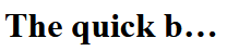
<h1>The quick brown fox jumped over the lazy dog</h1>
</body>
</html>
You can see the effect on the text here:
Wrap-Up
And there you have it! If you’re looking to truncate text with ellipsis, the CSS text-overflow property is your best bet. With some simple CSS rules, it can be done easily.
 The Computer Chick