
As UX and frontend developers already know, animation is crucial to modern web development. Loading content on your page is one scenario which comes to mind and perfectly demonstrates why this matters. Today, we will look at three examples of loaders that can be added to your Angular website to improve the user experience.
Procedure
As in previous tutorials, let’s first install Node and npm:
- Node: https://nodejs.org/
- npm: https://www.npmjs.com/
Set up the Angular project by installing the Angular CLI tool:
npm install -g @angular/cliCreate a project called my-loaders:
ng new my-loadersEnter the project directory:
cd my-loadersInstall Angular Material:
ng add @angular/materialOption 1: Angular Material Progress Bar
The progress bar from Angular Material is an excellent first choice for a loading indicator, as it involves minimum disruption to the flow of the page while still informing the user of loading content.
app.html
<div class="bars">
  <mat-progress-bar class="red" mode="indeterminate"></mat-progress-bar>
  <mat-progress-bar class="blue" mode="indeterminate"></mat-progress-bar>
  <mat-progress-bar class="pink" mode="indeterminate"></mat-progress-bar>
  <mat-progress-bar mode="buffer"></mat-progress-bar>
</div>
app.scss
@use '@angular/material' as mat;

.red {
  @include mat.progress-bar-overrides((
    active-indicator-color: orange,
    track-color: red,
  ));
}

.blue {
  @include mat.progress-bar-overrides((
    active-indicator-color: blue,
  ));
}

.pink {
  @include mat.progress-bar-overrides((
    active-indicator-color: pink,
  ));
}

.bars {
    display: flex;
    flex-direction: column;
    align-items: center;
    gap: 100px;
    padding: 50px;
    color: orangered
}
Result:

Option 2: Angular Material Progress Spinner
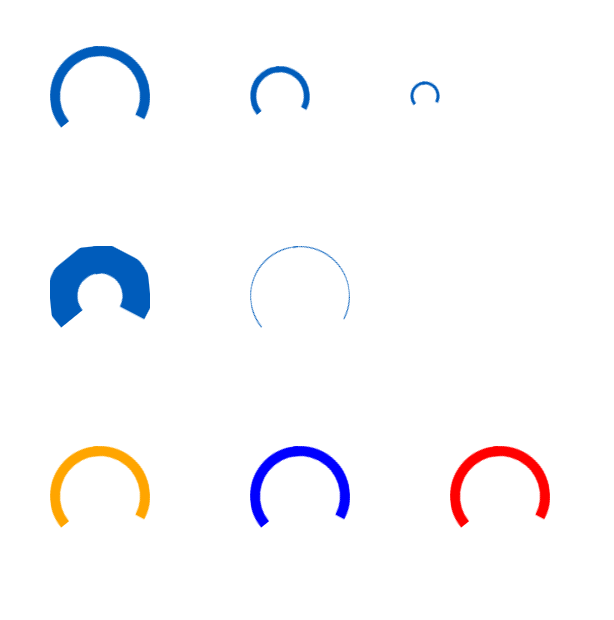
Angular Material offers another great loading option: the progress spinner. This works well for loading the entire page, however it can also be used to load individual elements.
app.html
<div class="spinners">
  <mat-spinner></mat-spinner>
  <mat-spinner diameter="60"></mat-spinner>
  <mat-spinner diameter="30"></mat-spinner>
</div>
<div class="spinners">
  <mat-spinner strokeWidth="30"></mat-spinner>
   <mat-spinner strokeWidth="1"></mat-spinner>
</div>

<div class="spinners">
  <mat-spinner class="orange"></mat-spinner>
  <mat-spinner class="blue"></mat-spinner>
  <mat-spinner class="red"></mat-spinner>
</div>
app.scss
@use '@angular/material' as mat;

.orange {
  @include mat.progress-spinner-overrides((
    active-indicator-color: orange,
  ));
}

.blue {
  @include mat.progress-spinner-overrides((
    active-indicator-color: blue,
  ));
}

.red {
  @include mat.progress-spinner-overrides((
    active-indicator-color: red,
  ));
}

.spinners {
    display: flex;
    align-items: center;
    gap: 100px;
    padding: 50px;
}
Result:
Option 3: NGX Skeleton Loader
Skeleton loaders show a simplified preview of the content to be displayed. No data-specific text or images will be shown, but it should be easy to predict where the content will appear. NGX Skeleton Loader provides a solution for Angular projects.
Let’s install the NGX Skeleton loader:
npm install ngx-skeleton-loader --saveapp.html
<div class="skeleton-loader">
  <ngx-skeleton-loader
    count="2"
    appearance="square"
    size="400px"
  />
  <ngx-skeleton-loader count="3" appearance="line" />
</div>
app.scss
.skeleton-loader {
  display: flex;
  flex-direction: column;
  padding: 100px;
}
Result:

Conclusion
As you can see, there are multiple options to indicate loading in your project, whether you prefer a component library such as Angular Material or an npm package like the NGX Skeleton Loader. What other loaders do you like to use?
 The Computer Chick
1 Comment