
Hello,
I want to write a post about a neat JavaScript library called angular-gridster2:
https://www.npmjs.com/package/angular-gridster2
This Angular-friendly library allows you to create a highly-customizable tile grid layout with features such as drag-and-drop, swap, and resizing. Additionally, event handlers are provided for these functionalities.
Today we’re going to build an Angular UI that allows you to create icon tiles and place them on your grid. The final result will look like this:
Skill prerequisites
- Fundamental HTML and CSS/SCSS knowledge
- Experience with Angular 2+ and TypeScript.
- Familiarity with Angular Material components.
Source Code
You can refer to the code of the final result here:
https://github.com/LucyVeron/gridster-tutorial
Procedure
First, we’ll need to set up your environment. If you don’t already have them, go ahead and install the latest stable versions of Node and npm.
- Node: https://nodejs.org/es/
- npm: https://www.npmjs.com/
Next we’ll get our Angular project up and running. Install the Angular CLI tool, which will help us manage our project:
npm install -g @angular/cli
Create a new project with the ng new command:
ng new my-gridster-dashboard
We’ll use Angular Material’s prebuilt components and styles. Use the ng add command to add Angular Material to the project:
ng add @angular/material
Let’s use the SCSS stylesheet syntax so that we can use features such as rule nesting. First, rename app.component.css to app.component.scss. Don’t forget!! We have to update the stylesheet reference in the component file. Go into app.component.ts in the component decorator’s styleUrls array and change the file extension:
@Component({
  selector: 'app-root',
  templateUrl: './app.component.html',
  styleUrls: ['./app.component.scss']
})
export class AppComponent implements OnInit {
Boot up the local development server and see what the application looks like. Start the server with the ng serve Angular CLI command:
ng serve
Open your browser and navigate to localhost:4200. Here’s what you should see:
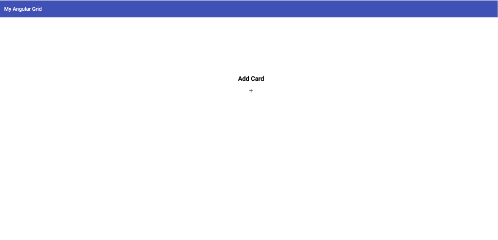
Alright, let’s replace the HTML in app.component.html with our own content:
<mat-toolbar color="primary">
  <mat-toolbar-row>
    <span>My Angular Grid</span>
  </mat-toolbar-row>
</mat-toolbar>

<div matRipple class="add-panel">
  <div class="add-panel-contents">
    <h2>Add Card</h2>
    <mat-icon>add</mat-icon>
  </div>
</div>
We’re using some Angular Material components, so we’ll add their modules and import statements to the app.component.module.ts file:
import { NgModule } from '@angular/core';
import { MatCardModule } from '@angular/material/card';
import { MatRippleModule } from '@angular/material/core';
import { MatIconModule } from '@angular/material/icon';
import { MatToolbarModule } from '@angular/material/toolbar';
import { BrowserModule } from '@angular/platform-browser';
import { BrowserAnimationsModule } from '@angular/platform-browser/animations';
import { AppComponent } from './app.component';

@NgModule({
  declarations: [
    AppComponent
  ],
  imports: [
    BrowserModule,
    BrowserAnimationsModule,
    MatToolbarModule,
    MatCardModule,
    MatIconModule,
    MatRippleModule
  ],
  providers: [],
  bootstrap: [AppComponent]
})
export class AppModule { }
Add some style in app.component.scss:
.add-panel {
  display: flex;
  padding-top: 150px;
  align-items: center;
  flex-direction: column;
  width: 100vw;
  height: 77vh;
  &-contents {
    display: flex;
    flex-direction: column;
    align-items: center;
    padding: 5rem;
    cursor: pointer;
  }
}
Check your browser and you will now see this:
Ok, we made a toolbar and an “Add card” custom div element. Next we’ll write a click function which will trigger a dialog that lets us add a new tile to our grid.
To create the Angular Material dialog, we’ll use the Angular CLI tool to generate a new component for the dialog:
ng g c add-card-dialog
This command will make a new directory containing the component file, HTML template, and stylesheet for the dialog. Go back to app.component.ts and write the function inside the AppComponent class which opens the dialog. We also need to inject the dialog service through the constructor so we can open the dialog and pass data through it (which we’ll do later):
  constructor(public dialog: MatDialog) { }

   ...

  public addCard(): void {
    const dialogRef = this.dialog.open(AddCardDialogComponent);
  }
Make sure to register the dialog component in the app.component.module.ts file by adding it to the entryComponents array. Don’t forget to add the Material Dialog module here too:
@NgModule({
  declarations: [
    AppComponent
  ],
  imports: [
    BrowserModule,
    BrowserAnimationsModule,
    MatToolbarModule,
    MatCardModule,
    MatIconModule,
    MatRippleModule,
    MatDialogModule
  ],
  entryComponents: [
    AddCardDialogComponent
  ],
  bootstrap: [AppComponent]
})
export class AppModule { }
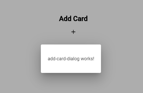
Check the web browser again. Click “Add card” to open the new dialog:
Ok, now we’ll add some content. We want to generate a new card containing an icon and color of our choice. In our dialog component, we’ll add a form containing the dropdown menus to make our selections, a preview of our icon, and some action buttons. We’ll make the template in app-card-dialog.component.html:
<h2 mat-dialog-title>Add Card</h2>
<mat-dialog-content>
    <form>
        <mat-form-field>
            <mat-label>Icon</mat-label>
            <mat-select [formControl]="icon">
                <mat-select-trigger *ngIf="icon.value">{{icon.value.name}}</mat-select-trigger>
                <mat-option *ngFor="let i of icons" [value]="i">
                    <mat-icon>{{i.icon}}</mat-icon>
                    <span>{{i.name}}</span>
                </mat-option>
            </mat-select>
        </mat-form-field>
        <ng-container *ngIf="icon.value">
            <label>Color</label>
            <mat-radio-group [(ngModel)]="color" name="color">
                <mat-radio-button *ngFor="let color of colors" [value]="color">
                    {{color}}
                </mat-radio-button>
            </mat-radio-group>
        </ng-container>
        <div *ngIf="icon.value" class="preview">
            <mat-icon *ngIf="icon && icon.value" color="{{color}}">
                {{icon.value.icon}}
            </mat-icon>
        </div>
    </form>
</mat-dialog-content>
<mat-dialog-actions align="end">
    <button mat-button mat-dialog-close>Cancel</button>
    <button mat-raised-button color="primary" (click)="addCard()">Add</button>
</mat-dialog-actions>
…and add styles to add-card-dialog.component.scss (NOTE: Change the file extension to scss and update the import in the add-card-dialog.component.ts styleUrls array like we did earlier):
form {
  min-width: 150px;
  max-width: 500px;
  width: 100%;
}

mat-dialog-content {
  max-height: 90vh;
  overflow: unset;
}

mat-form-field {
  width: 100%;
}

mat-radio-group {
  display: flex;
  flex-direction: column;
  margin: 15px 0;
}

mat-radio-button {
  margin: 5px;
}

.preview {
  padding: 4rem;
  position: relative;
  display: flex;
  flex-direction: column;
  align-items: center;
  & mat-icon {
    position: absolute;
    top: -7px;
    left: 52px;
    font-size: 120px;
  }
}
Here’s the updated app.component.module.ts with the newly added Material modules, the Forms and ReactiveForms modules, and the Mat Dialog module:
import { NgModule } from '@angular/core';
import { FormsModule, ReactiveFormsModule } from '@angular/forms';
import { MatButtonModule } from '@angular/material/button';
import { MatRippleModule } from '@angular/material/core';
import { MatDialogModule } from '@angular/material/dialog';
import { MatFormFieldModule } from '@angular/material/form-field';
import { MatIconModule } from '@angular/material/icon';
import { MatInputModule } from '@angular/material/input';
import { MatRadioModule } from '@angular/material/radio';
import { MatSelectModule } from '@angular/material/select';
import { MatToolbarModule } from '@angular/material/toolbar';
import { BrowserModule } from '@angular/platform-browser';
import { BrowserAnimationsModule } from '@angular/platform-browser/animations';
import { AddCardDialogComponent } from './add-card-dialog/add-card-dialog.component';
import { AppComponent } from './app.component';

@NgModule({
  declarations: [
    AppComponent,
    AddCardDialogComponent
  ],
  imports: [
    BrowserModule,
    BrowserAnimationsModule,
    FormsModule,
    ReactiveFormsModule,
    MatToolbarModule,
    MatIconModule,
    MatRippleModule,
    MatDialogModule,
    MatButtonModule,
    MatFormFieldModule,
    MatInputModule,
    MatSelectModule,
    MatRadioModule
  ],
  entryComponents: [
    AddCardDialogComponent
  ],
  bootstrap: [AppComponent]
})
export class AppModule { }
Now add the business logic in add-card-dialog.component.ts:
import { Component } from '@angular/core';
import { FormControl } from '@angular/forms';
import { MatDialogRef } from '@angular/material/dialog';

export interface Icon {
  name: string;
  icon: string;
}

@Component({
  selector: 'app-add-card-dialog',
  templateUrl: './add-card-dialog.component.html',
  styleUrls: ['./add-card-dialog.component.scss']
})
export class AddCardDialogComponent {

  constructor(
    public dialogRef: MatDialogRef<AddCardDialogComponent>,
  ) { }

  public result: any;

  public icon = new FormControl();
  public icons: Icon[] = [
    {
      name: 'Build',
      icon: 'build'
    },
    {
      name: 'Smiley',
      icon: 'sentiment_satisfied_alt'
    },
    {
      name: 'Favorite',
      icon: 'favorite'
    },
    {
      name: 'Star',
      icon: 'grade'
    }
  ];

  public color = 'default';
  public colors: string[] = [
    'default',
    'primary',
    'accent',
    'warn'
  ];

  public addCard(): void {
    this.result = {
      color: this.color,
      icon: this.icon.value
    };
    this.dialogRef.close(this.result);
  }
}
Here we define the contents of our dropdowns for the icon and color as well as the function we will use to generate the new card. We will pass the resulting data from the dialog back down to the main app component for further processing.
The resulting dialog should look like this:
Now for the fun part: Install Gridster through npm:
npm install --save-dev angular-gridster2
Ok, time to set everything up for our grid. Add the Gridster module to app.component.module.ts:
import { GridsterModule } from 'angular-gridster2';

@NgModule({
  imports: [ GridsterModule ],
  ...
})
In our component file, we will add some logic. We have the options variable, which helps us define our grid specs when the component loads, such as tile size and grid type. We also need a dashboard variable, which is an array of all our tiles and their configurations. We’ll take the data passed down from the closed dialog, build the new tile’s configuration, and push it to the dashboard array. This new tile will be added to our grid. With this process, we can keep adding as many new tiles to our grid as we want.
Here’s the updated business logic (app.component.ts):
import { Component, OnInit } from '@angular/core';
import { MatDialog } from '@angular/material/dialog';
import { DisplayGrid, GridsterConfig, GridType } from 'angular-gridster2';
import { AddCardDialogComponent } from './add-card-dialog/add-card-dialog.component';

@Component({
  selector: 'app-root',
  templateUrl: './app.component.html',
  styleUrls: ['./app.component.scss']
})
export class AppComponent implements OnInit {

  public card: any;
  public options: GridsterConfig;
  public dashboard: Array<any>;

  constructor(public dialog: MatDialog) { }

  ngOnInit() {
    this.options = {
      gridType: GridType.Fixed,
      fixedColWidth: 200,
      fixedRowHeight: 200,
      draggable: { enabled: true }
    };
    this.dashboard = [];
  }

  public addCard(): void {
    const dialogRef = this.dialog.open(AddCardDialogComponent);
    dialogRef.afterClosed().subscribe((config: any) => {
      if (!config) { return; }
      this.dashboard.push({ config, cols: 1, rows: 1, y: 0, x: 0 });
    });
  }
}
We’ll add the gridster dashboard to our HTML. This consits of a <gridster> tag that uses the [options] attribute to define our grid’s characteristics. On the <gridster-item> tag we see an *ngFor loop that generates each tile we want to add. The [item] attribute gives each tile its unique configuration. Now let’s update the template (app.component.html):
<mat-toolbar color="primary">
  <mat-toolbar-row>
    <span>My Angular Grid</span>
  </mat-toolbar-row>
</mat-toolbar>

<div *ngIf="!dashboard.length" matRipple class="add-panel">
  <div class="add-panel-contents" (click)="addCard()">
    <h2>Add new card</h2>
    <mat-icon>add</mat-icon>
  </div>
</div>

<gridster *ngIf="dashboard.length" [options]="options">
  <gridster-item [item]="item" *ngFor="let item of dashboard">
    <div class="card-content">
      <mat-icon color="{{item.config.color}}">{{item.config.icon.icon}}</mat-icon>
    </div>
  </gridster-item>
</gridster>

<button class="floating-button" *ngIf="dashboard.length" mat-fab color="accent" matTooltip="Add card" (click)="addCard()">
  <mat-icon>add</mat-icon>
</button>
Notice that we’ve also included a floating action button (FAB) in the bottom-right corner so we can keep adding new cards once the “Add card” element disappears.
Here is the updated stylesheet (app.component.scss):
mat-toolbar {
  display: flex;
  flex-direction: row;
  align-items: center;
  & span {
    flex: auto;
  }
}
.add-panel {
  display: flex;
  padding-top: 150px;
  align-items: center;
  flex-direction: column;
  width: 100vw;
  height: 77vh;
  &-contents {
    display: flex;
    flex-direction: column;
    align-items: center;
    padding: 5rem;
    cursor: pointer;
  }
}
gridster {
  height: 93vh;
}
.card-content {
  position: relative;
  width: 100%;
  height: 100%;
  display: flex;
  justify-content: center;
  align-items: center;
  cursor: pointer;
  & mat-icon {
    font-size: 200px;
    position: absolute;
    top: 0;
    left: 0;
  }
}
.floating-button {
  position: absolute;
  bottom: 2rem;
  right: 2rem;
}
That’s it! Go ahead and try out the new dashboard in the browser. I recommend checking out the Gridster demo page to explore the API and more grid configuration options:
https://tiberiuzuld.github.io/angular-gridster2/


 The Computer Chick
Hi Lucy,
really great post. Very helpful and very well written! Thank you!
Side remark and just in case: Here is a minor typo, I stumbled over when I walked through: The initial “+” button was missing the (click) handler.
Cheers
Jens
LikeLike
Hi Jens, the initial + button is the step that happens before you add the click handler. I included later in the HTML. : )
LikeLike
I’m a little confused how you were able to get “add-card-dialog works!” without referencing addCard() in the beginning like this in your html: add
It’s possible I didn’t quite follow the documentation.
LikeLike
Hi Lassie, the “add-card-dialog works!” text is the default HTML that is generated by the Angular CLI when you create a new component. : )
LikeLike